How would you like to read a genuine medieval manuscript?

In this two-part series we will do just that. I’ve selected a very handsomely written 11th century Carolingian manuscript of Vergil’s Aeneid. The writing is quite clear and it has a decent number of scribal abbreviations, but it is quite manageable for those trying to read Latin on parchment for the first time. At some point I might make similar posts for Ancient Greek and Middle English, so even if you don’t know Latin, I hope I can introduce you to the joys of reading medieval manuscripts.
My approach is to parachute you into the thick of the action and explain the rules as we go. If you prefer a more comprehensive and top-down approach, the best resource for you is the classic introduction, The elements of abbreviation in medieval Latin paleography by Adriano Cappelli, first published 1899, translated by David Heimann and Richard Kay in 1982. Cappelli’s work looks broadly at various scribal abbreviations across more than a thousand years of manuscript traditions, and if I were to try the same approach, I bet that my humble blog post wouldn’t come close to competing with how well he explained this subject. Instead, for the sheer pleasure of reading Latin from parchment, I will walk you through the quirks of one particular manuscript at one particular point in time and hope that this will whet your appetite for further study.
The manuscript I’m using can be fully viewed here, courtesy of the British Library’s Digitised Manuscripts. The section we are looking at starts at this page, and you can check it against a plain Latin text of the Aeneid here. Our manuscript starts at line 394 of book seven of the Aeneid.
1: The script
Carolingian Minuscule is a very reader-friendly Latin script, mainly because its long ascenders and descenders (eg. the tall part of “d” and the down-stroke of “q”) help give each letter a visually distinctive shape. It was developed during the Carolingian Renaissance and spread widely across Western Europe between approximately the ninth and thirteenth centuries. Although it was superseded by the Gothic or Blackletter script family in many regions during the late medieval period, it was admired by humanists in the fifteenth and sixteenth centuries and eventually formed the basis of our modern lower-case typography.
2: The long s
In the 11th century (and for most of the history of Latin manuscripts and early print books), it was conventional to use the “long s” instead of the more recognisable “snakey s”. This long s looks very much like an f. Let’s compare the letters in the example below:

At once the grim goddess is lifted here on dusky wings (Aen. VII.408)
The long s has a kind of bump on the left hand side, instead of having a line all the way through like an f. This may seem like a tiny difference, and the verse above may have been a pain to read at first, but do persist. With some practice, it doesn’t take too long to get used to the distinction and the new shapes of words. Try reading the texts aloud – enunciating the “s” sound – as you work through these passages, to help familiarise yourself with the letters.

One more note on the long s. When an s appears at the end of a word in this manuscript, it may be written in the more familiar snakey s form. There does not seem to be any reason why one form of s is chosen to end a word rather than the other, at least not in this document.
3: Mandatory ligatures
Ligatures are composite letter shapes that are formed when a scribe joins two letters together. Some ligatures are very minor alterations which make the task of writing flow more easily, or which avoid awkward overlaps between neighbouring letters.
The “st”, “sl”, “ss”, “ft”, “fl” and “ff” ligatures are mandatory in most miniature scripts (that is, scripts which have ascenders and descenders). These ligatures are not difficult to read, however, because they do not significantly alter the shapes of the letters.
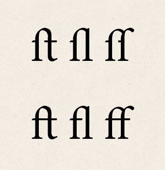
ft, fl, ff
Look out for the st ligatures in the example below. Also, in case you haven’t already realised, the first letter of each of these lines is written in rustic capitals, and the scribe has left a margin between the first letter and the rest of the line. In this manuscript, headings and initial letters of chapters or lines are “capitalised”, but proper nouns are not.
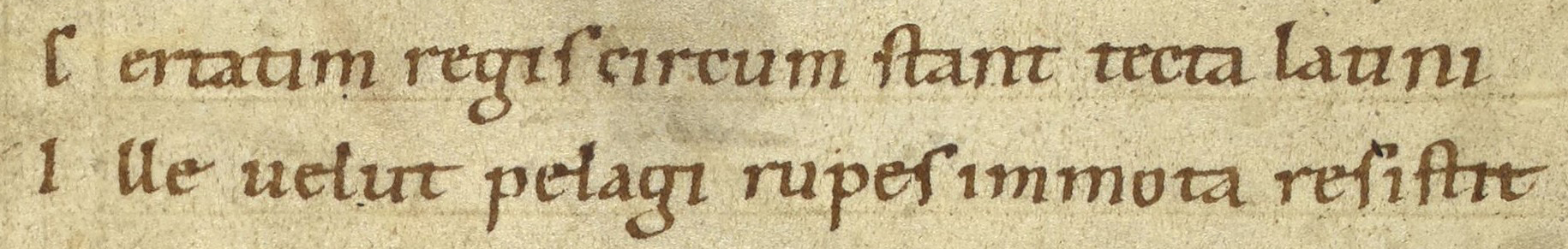
Ille velut pelagi rupes immota resistit
In rivalry they stood about the palace of king Latinus;
He stood firm like an immovable rock of the sea (7.585)
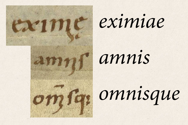
4: The m- and n-tilde
Scribal abbreviations are a set of marks, squiggles, lines and dots which denote missing letters. Most (though not all) scribal abbreviations were originally letters drawn above, beside or below other letters. Over time the floating letters became more cramped and were reduced to tighter, smaller symbols.
The tilde (little horizontal squiggle) shown below was originally a tiny letter m or n written above the preceding letter. It indicates that an m or an n should occur after the letter it is written above. This device is really common at the ends of words in the Latin accusative case. The m- or n-tilde is also sometimes found in the middle of a word, as in the case of “omni” below.
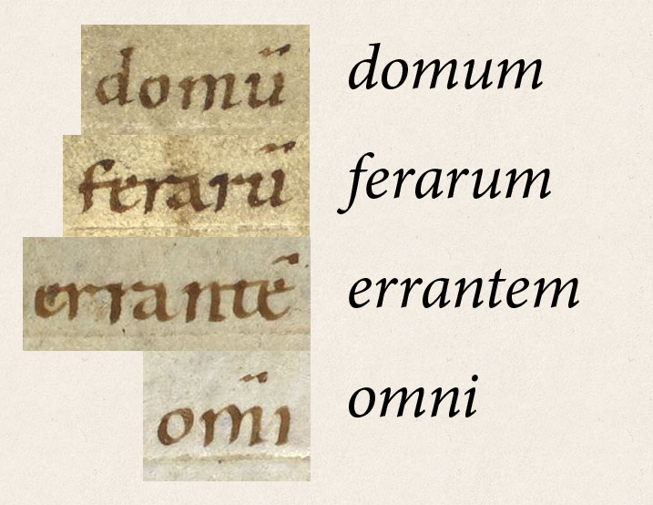
The example verse below has two tildes, one of which was re-worked by a later hand in darker ink to avoid confusion about the adjective’s corresponding noun.

Now in the pitch-black night he was enjoying the middle of his rest
5: The ae diphthong
In Medieval Latin, the ae diphthong could be written several ways. One method was to crunch the letters together into the æ character, traditionally called an “ash” in English. Another way, which this Carolingian manuscript employs, was to write an e with a small hooked mark below, presumably indicating an a that was once there. Other medieval documents, such as the 1215 Magna Carta, simply used an e in place of ae.
The move to substitute e for the ae diphthong may have been motivated in part by the change in pronunciation. In Vergil’s day, ae probably had an “ai” sound like the English word “eye”, whereas by the early Middle Ages the diphthong was scarcely distinguishable from the sound of the letter e, as evidenced from misspellings in works such as the Confession of Saint Patrick.

And here’s an example of the ae abbreviation. In the following line, note that punctuation is a little irregular. Some words do not have spaces between them, though most are properly spaced. Also, the dot after “matres” indicates the caesura (a pause in poetic meter in the middle of a line), but not the end of the sentence. The second dot actually does mark the end of the sentence.

And fearful mothers clasped children to their breasts. (7.518)
6: The marks for -que and -ibus
-que and -ibus (or -bus) are very common endings in Latin. The first is an alternate way of saying “and”, and the second is the dative or ablative plural of third, fourth and fifth declension nouns. Probably by sheer coincidence, the abbreviation marks for both of these endings ended up looking similar, however they are very easily distinguished by the preceding letter. They both use a squiggle that came to closely resemble a semicolon; thus “-que” looks like “-q;” and “-ibus” looks like “-ib;”.

Note that the same semicolon-like mark is also used for the dative or ablative dual ending, which is evident in the word ambobus below.
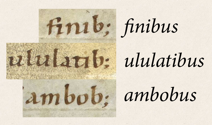
In the following verses, be wary that the name “Calybe” (a priestess of Juno) is given in the variant spelling of “Chalibe”.
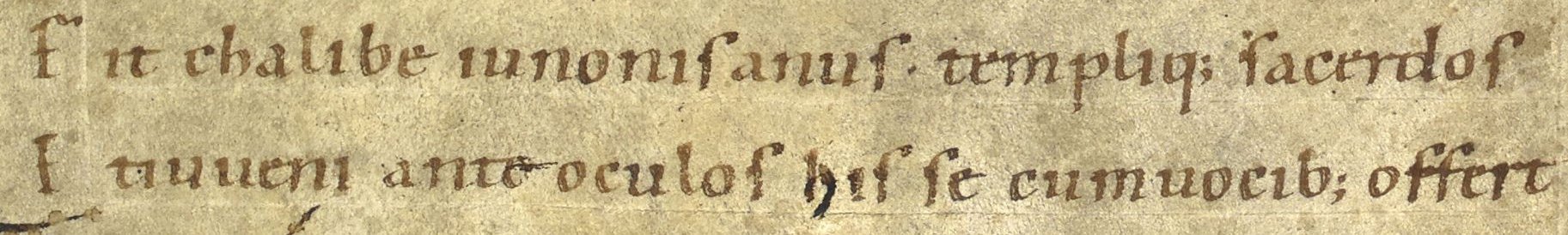
Et iuveni ante oculos his se cum vocibus offert
She was Calybe, an old woman of Juno and the priestess of her temple,
And she appeared to the young man before his eyes with these words (7.419-20)
7: The ampersand (&)
The most famous ligature of all is the & or ampersand, which was originally formed from the letters of the Latin word for “and”, et:

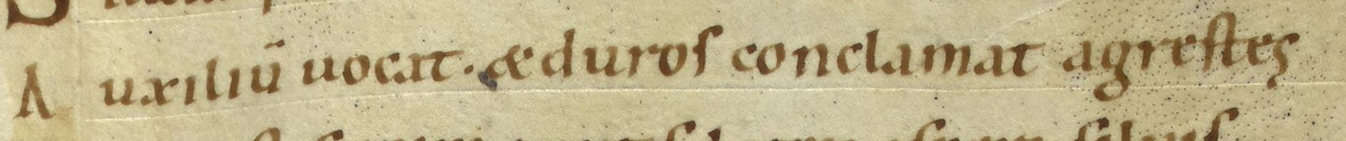
She called for help and rallied the hardy country-folk. (7.504)
Although & usually stands for the word “and”, it may also be used as part of any word which includes the letter sequence et, even if the et spans the ae diphthong.
![Centum aerei claudunt vectes aeternaque ferri A hundred bronze bars close them, and the everlasting [sc. strength] of iron](https://foundinantiquity.com/wp-content/uploads/2014/05/ampersand-aeterna.jpg)
A hundred bronze bars close them, and the everlasting [sc. strength] of iron (7.609)
8: The -ns and -nt ligatures
Some ligatures preserve letter shapes which are different in style from the rest of the script. For example, the n in these ligatures looks like a capital rather than a small letter:
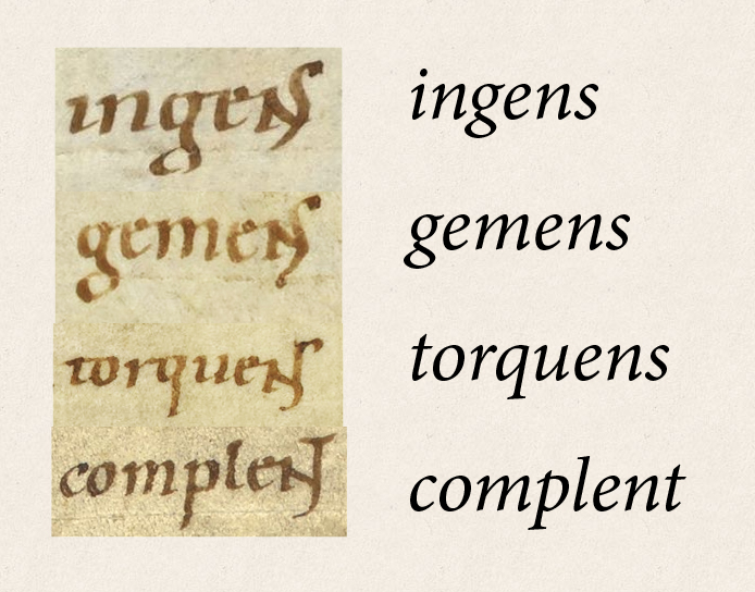
The “-ns” and “-nt” ligatures are not compulsory in this manuscript, and appear to be space saving devices because they are somewhat more common at the end of the line where the scribe is more space-conscious.
In the example below, the scribe made the mistake of writing “matrem” (mother) instead of “Martem” (Mars). The error is underlined and the correct letters are written above the word.
![Undique collecti coeunt Martemque fatigant. Gathered on all sides, they come together and exhaust [the battle-spirit of] Mars. (7.582)](https://foundinantiquity.com/wp-content/uploads/2014/05/nt-ligature-example.jpg)
Gathered on all sides, they come together and exhaust [the battle-spirit of] Mars. (7.582)
9: The -i- ligature
If the scribe adds a slightly wavy vertical line to the bottom-right of a character, this means that an i should be inserted after that character. This ligature only ever occurs in the middle of a word.
The line below is one of my favourite lines in book 7 of the Aeneid.

There are twin gates of war (so they call them by name) (7.607)
To be continued…
Stay tuned for Part 2! In the mean time, you can test your reading skills by looking at the 11th century Vergil’s Aeneid manuscript here, starting from this page. There are still a number of scribal abbreviations to be explained, but if you get stuck you can always check the plain Latin text of the Aeneid here. Our manuscript starts at Aeneid book 7, line 394.

8 responses to “How to read an ancient manuscript: 11th century Vergil’s Aeneid (Part 1)”
Merci pour cette excellente présentation !
I absolutely love this – looking forward to more!
[…] How to read an ancient manuscript: 11th century Vergil’s Aeneid (Part 1) (foundinantiquity.com) […]
[…] ← How to read an ancient manuscript: 11th century Vergil’s Aeneid (Part 1) […]
That’s amazing! I love it. Thank you!
Hello, I was wondering if someone could show me what the correct (common) abbreviations and concatenations woud be for these Latin words?
Hoc parum flamma
tamdiu incepit antequam sciremus qui eramus semel amisit in immenso temporis et spatio nunc mirum in modum inventum et pretiosum
Hoc parum flamma
ardens stoicus et fortis, lucernam ducens nos ducit nos in ventis vehementibus vitae nostrae in occultatum arce secretus, ab hostibus protectus, tutum ab hominibus qui non intelligent possent exstinguerent et mitte nos in tenebras
Hoc parum flamma
lucet clara et cum una sumus sicut duo Phoenix tineis igne dulci consumimur tum renascentes animas avolare, ad vias difficiles paratas
Nostrae parum flammae
So far I have come up with this for the first bit…
Hoc parũ flamma
tamdiu incepit antequã ſciremuſ qui eramuſ ſemel amiſit in immenſo temporiſ & ſpatio nunc mirũ in modũ inventũ & pr&ioſũ
Salvete Carla, could you use ”cathomson@live.co.uk” as a contact email address? Gratias tibi ago, Carleos.